In this article we will discuss multiple ways to plot a correlation matrix in pandas.
Table of Contents
Preparing DataSet
To quickly get started, let’s create a sample dataframe to experiment. We’ll use the pandas library with some random data.
import pandas as pd
import numpy as np

# DataFrame with some random values
df = pd.DataFrame(np.random.randint(0,100, size=(100, 6)), columns=list('ABCDEF'))

print(df.head())
Contents of the created dataframe are,
    A   B   C   D   E   F
0   3  38  71  80  71  68
1  80  15  45  51  29  87
2   0  72  35  37  52  49
3  67  21  28  43  53  57
4  44  67  14  47  64  30
A correlation matrix is generally used to visualize the correlation coefficients between all the features in a DataFrame. To get the correlation matrix, we can simply use the “corr” function on the pandas DataFrame.
print(df.corr())
Output
          A         B         C         D         E         F
A  1.000000 -0.121004 -0.028870  0.081519 -0.082788  0.007588
B -0.121004  1.000000  0.137948  0.186861  0.072054 -0.042191
C -0.028870  0.137948  1.000000  0.105994 -0.015434  0.010137
D  0.081519  0.186861  0.105994  1.000000  0.027067  0.105773
E -0.082788  0.072054 -0.015434  0.027067  1.000000 -0.003142
F  0.007588 -0.042191  0.010137  0.105773 -0.003142  1.000000
Here you have the correlation coefficients for all the feature combinations. Obviously, it is a little difficult to interpret, which is why visualizing this matrix can help understand the insights better.
Frequently Asked:
- Get Column Average or Mean in Pandas
- Pandas: Get last row of dataframe
- Pandas Tutorial #16 – DataFrame GroupBy
- Pandas – Select Rows where column value is in List
Styling the correlation matrix directly
The simplest way to visualize the correlation matrix is to directly color-code the above matrix. We are going to the style attribute to add some background gradient.
# storing the correlation matrix
corr = df.corr()

# adding background gradient
corr.style.background_gradient(cmap='coolwarm')
Output
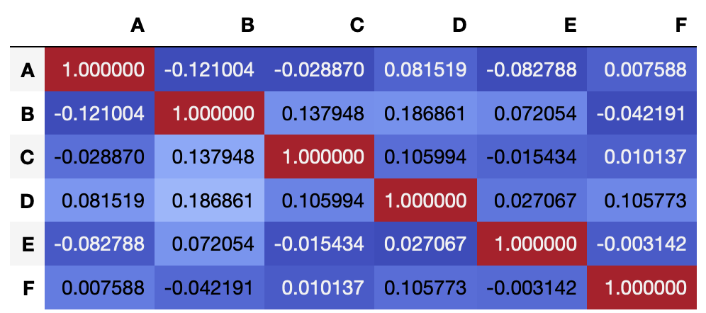
Adding a background gradient makes it slightly easier to read, as the dark blue color shows more negatively correlated features while the lighter shades show more positively correlated features. We can play around with these gradients using the cmap attribute.
Using matplotlib plotting library
Matplotlib is the standard library in python for all visualization methods. We are going to use it for plotting the correlation matrix as below.
# import
import matplotlib.pyplot as plt

# set figure size
f = plt.figure(figsize=(8, 8))

# using matshow
plt.matshow(df.corr(), fignum=f.number)

# adding color scale
cb = plt.colorbar()
cb.ax.tick_params(labelsize=14)

# print
plt.show()
Output
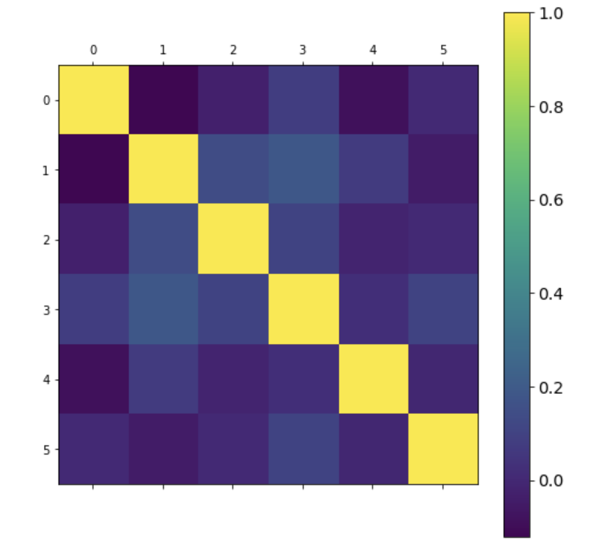
As observed, we have similar output as the above method where the darker blue shade shows a more negative correlation and the light blue color shows a more positive correlation.
Using Seaborn heatmaps
Another easier way to plot the correlation matrix is to use the heatmaps from the seaborn library. Heatmaps, as the name suggests, are a graphical representation of data where values are depicted by color. Let’s plot the correlation matrix below.
# import
import seaborn as sns

# heatmap using seaborn
sns.heatmap(df.corr(), annot=True)
Output
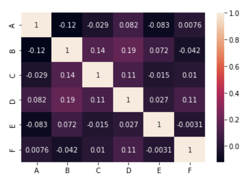
As observed, this also gives us a similar output with a clean representation with values (annotations) as well.
Summary
In this article, we have discussed multiple ways to plot the correlation matrix in pandas.