In this article, we will learn how to use different marking styles to mark the data points while plotting a line graph using matplotlib in python.
Markers parameter in the plot() method is used to mark the data points in our plot. In this article, we will discuss different marker styles and the changes we can make to the markers.
Let us look at the syntax of matplotlib.pyplot.plot(),
plt.plot(x,y, scalex=True, scaley=True, data=None, marker=’marker style’, **kwargs)
Below are the arguments we can pass in the plot method that would help us in making changes to our makers,
Parameters:
- x, y : These can be arrays or any array-like object.
- They represent the horizontal/vertical coordinates of the data points.
- data : indexable object, optional. An object with labeled data.
- If provided, then will be used as the label names to plot in *x* and *y*.
- scalex, scaley : bool, default: True
- Optional parameters.
- These parameters determines if the view limits are adapted to the data limits or not.
- The values are passed on to `autoscale_view`.
- Marker: The available marker styles that can be used,
- “’.’“ point marker
- “’,’“ pixel marker
- “’o’“ circle marker
- “’v’“ triangle_down marker
- “’^’“ triangle_up marker
- “'<‘“ triangle_left marker
- “’>’“ triangle_right marker
- “’1’“ tri_down marker
- “’2’“ tri_up marker
- “’3’“ tri_left marker
- “’4’“ tri_right marker
- “’s’“ square marker
- “’p’“ pentagon marker
- “’*’“ star marker
- “’h’“ hexagon1 marker
- “’H’“ hexagon2 marker
- “’+’“ plus marker
- “’x’“ x marker
- “’D’“ diamond marker
- “’d’“ thin_diamond marker
- “’|’“ vline marker
- “’_’“ hline marker
- markeredgecolor or mec: color
- markeredgewidth or mew: float
- markerfacecolor or mfc: color
- markerfacecoloralt or mfcalt: color
- markersize or ms: float
- markevery: None or int or (int, int) or slice or List[int] or float or (float, float)
Let us start with a few examples to understand it better.
Examples of Line plot with markers in matplotlib
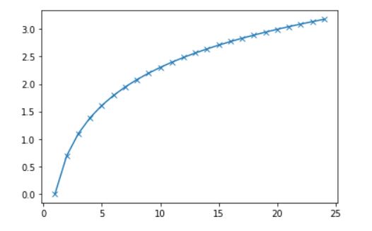
In our first example, we will create an array and passed to a log function.
import matplotlib.pyplot as plt
import numpy as np

x = np.arange(1,25,1)
y = np.log(x)

plt.plot(x,y, marker='x')
plt.show()
Output:
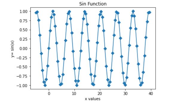
The marker that we have used is ‘D’ which will create Diamond shaped data points.
import matplotlib.pyplot as plt
import numpy as np

x = np.arange(-5,40,.5)
y = np.sin(x)

plt.plot(x,y, marker='D')
plt.title('Sin Function')
plt.xlabel('x values')
plt.ylabel('y= sin(x)')

plt.show()
Output
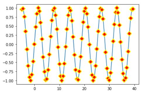
Let us now try to change color of our data point
import matplotlib.pyplot as plt
import numpy as np


x = np.arange(-5,40,.5)
y = np.sin(x)

plt.plot(x,y, marker='D',mfc='red')

plt.title('Sin Function')
plt.xlabel('x values')
plt.ylabel('y= sin(x)')

plt.show()
Output
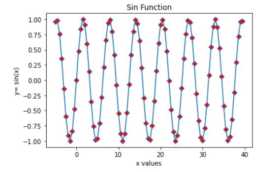
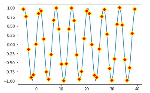
Notice that the color of our marker is changed to red. Now let us try to change the edge color of the marker and increase our marker size.
plt.plot(x,y, marker='D', mfc='red', mec='yellow',ms='8')
Output
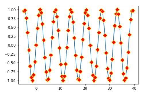
We can even increase or decrease the width of the marker edge
plt.plot(x,y, marker='D', mfc='red', mec='yellow',ms='8', mew='2')
Output
plt.plot(x,y, marker='D', mfc='red', mec='yellow',ms='8', mew='2', markevery=2)
Output
Summary
We can mark the data points in our graph using different kind of markers while plotting the graph.