In Python, the pyplot library of the Matplotlib module helps in achieving data visualization through easy ways. We can create different graphs, but in this article, we will be discussing the Line graph. We will be using the ‘plot’ method to view our data in a graphical representation.
pyplot.plot() syntax
Let us look at the plot function arguments,
plt.plot(x,y, scalex=True, scaley=True, data=None, **kwargs)
Parameters
- x, y : These can be arrays or any array-like object.
- They represents the horizontal/vertical coordinates of the data points.
- data : indexable object, optional. An object with labeled data.
- If provided, then will be used as the label names to plot in *x* and *y*.
- scalex, scaley : bool, default: True
- Optional parameters.
- These parameters determines if the view limits are adapted to the data limits or not.
- The values are passed on to `autoscale_view`.
Returns
- A list of Line2D objects, which represents the plotted data.
Matplotlib – Line Plot Examples
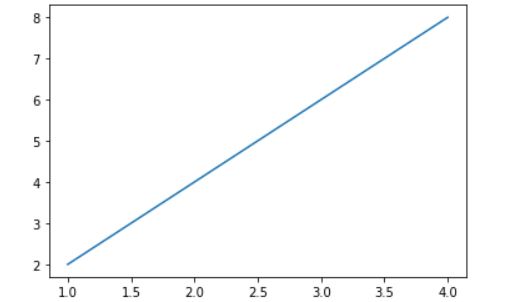
Example 1: plotting two lists
Let us start with a simple example where we have two arrays x and y, which we will be plotting on the graph,
import matplotlib.pyplot as plt

x= [1,2,3,4]
y=[2,4,6,8]

plt.plot(x,y)
plt.show()
Output:
Let us look at another example,
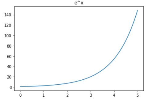
Example 2: plotting two numpy arrays
import matplotlib.pyplot as plt
import numpy as np

x = np.linspace(0,5,100)
y = np.exp(x)

plt.plot(x, y)
plt.show()
Output

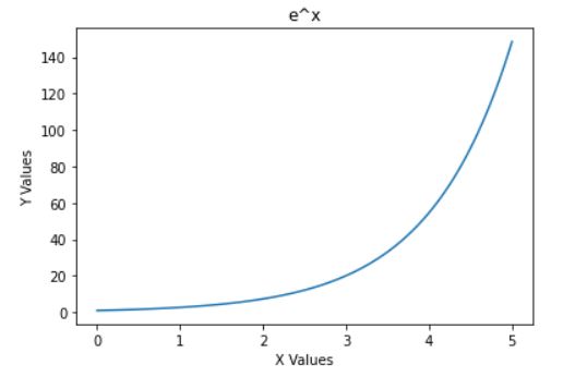
Add Titles and labels in the line chart using matplotlib
Now that we have learned to plot our data let us add titles and labels to represent our data in a better manner.
We will be using title() method to give a heading to the graph we have created in the previous example and label() method to define our x and y axis.
import matplotlib.pyplot as plt
import numpy as np

x = np.linspace(0,5,100)
y = np.exp(x)

plt.plot(x, y)
plt.title('e^x')
plt.show()
Output:
Now we can quickly identify that the graph we have created is of the function e^x. Let us add the labels to x and y axes.
plt.xlabel('X Values')
plt.ylabel('Y Values')

plt.show()
Output:
Matplotlib: Plot lines from numpy array
We can create a numpy array and pass the same in the plot method.
Here we have created a numpy array using the arrange() method. This will provide values from -5 to 20 with a step size of 0.5. The array is then passed into the square function to obtain y values.
import matplotlib.pyplot as plt
import numpy as np

x = np.arange(-5,20,.5)
y = np.square(x)

plt.plot(x,y)
plt.title('Square Function')
plt.xlabel('x values')
plt.ylabel('y= x^2')

plt.show()
Output:

Plot lines from Dataframe in Matplotlib
We can even create a dataframe and use the data to create our plot. We will be looking at 2 different methods to achieve the same output
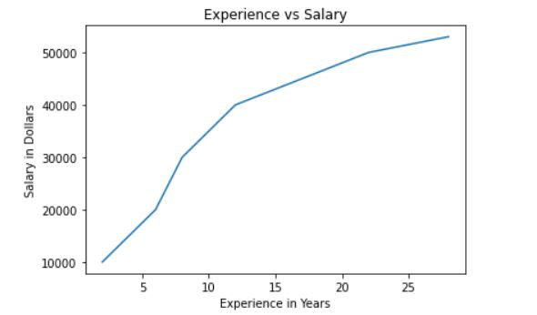
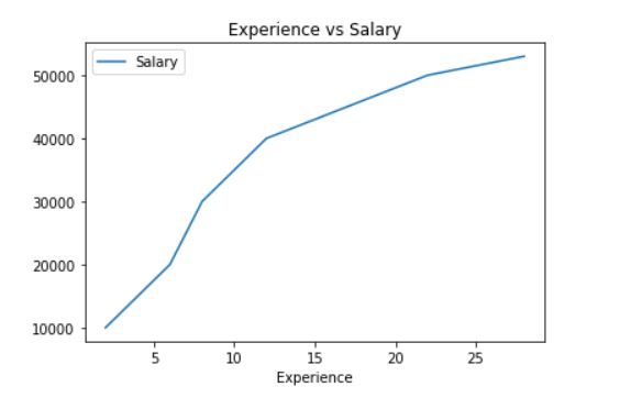
We have created a dataframe with years of work experience, and the salary received. Here we will fetch years and salary data and assign to x and y variables and then we can simply use the plot() method from matplotlib to plot our data.
from pandas import DataFrame
import matplotlib.pyplot as plt
import numpy as np

Data = {'Experience': np.arange(2,30,2),
        'Salary': [10000,15000,20000,30000,
                   35000,40000,42000,44000,
                   46000,48000,50000,51000,
                   52000,53000]
       }
df = DataFrame(Data,columns=['Experience','Salary'])
x=df.iloc[:,0]
y=df.iloc[:,1]

plt.title('Experience vs Salary')
plt.xlabel('Experience in Years')
plt.ylabel('Salary in Dollars')
plt.plot(x,y)

plt.show()
Output:
There is another way of achieving the same. We can call the plot function from dataframe to plot our data.
Datarframe.plot()
This method is used to make plots of Series or DataFrame. The plot method on Series and DataFrame is just a simple wrapper around plt.plot. It will take column names as labels
Let us look at the arguments
df.plot(data, x, y, kind)
Parameters
- x : label or position, default None
- It will be only used, if df is a DataFrame object.
- y : The label or position or list of label, positions.
- Default value is None
- Allows plotting of one column versus another. Only used if data is a DataFrame.
- kind : str
- The kind of plot to produce
Returns
- :class:`matplotlib.axes.Axes` or numpy.ndarray
Let’s see an example,
from pandas import DataFrame
import matplotlib.pyplot as plt
import numpy as np

Data = {'Experience': np.arange(2, 30, 2),
        'Salary': [10000, 15000, 20000, 30000,
                   35000, 40000, 42000, 44000,
                   46000, 48000, 50000, 51000,
                   52000, 53000]
        }
df = DataFrame(Data, columns=['Experience', 'Salary'])

df.plot(x='Experience',
        y='Salary',
        kind='line',
        title='Experience vs Salary')
Output:
Create time-series graph using dataframe and plot method
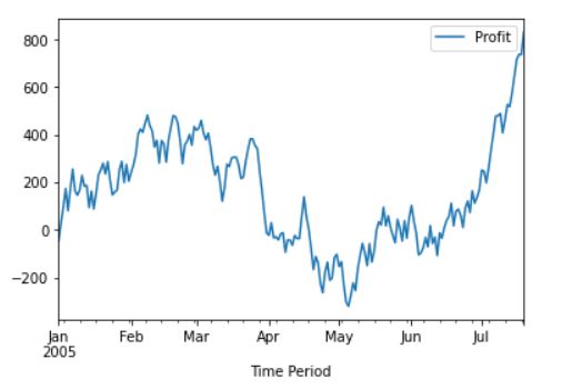
Firstly we have created a DataFrame with values of Profit ranging from -100% to 100 % for a time starting from January 2005.
import pandas as pd
import numpy as np
from pandas import DataFrame

Data = {'Profit':np.random.randint(-100,100,size=200),
        'Time Period': pd.date_range('1/1/2005', periods=200)
       }

df = DataFrame(Data,columns=['Profit','Time Period'])
df.set_index('Time Period', inplace=True)

print(df)
Output:
 Profit
Time Period
2005-01-01      -46
2005-01-02       74
2005-01-03       68
2005-01-04       78
2005-01-05      -93
...             ...
2005-07-15       71
2005-07-16       71
2005-07-17       21
2005-07-18       -1
2005-07-19       95

[200 rows x 1 columns]
Our dataframe has 200 rows and 1 column. Please note that the values you obtain will be different from the data displayed above,since we are using the random function.
Now we’ll find the cumulative value of the profit percentage
df=df.cumsum()
print(df)
Output
 Profit
Time Period
2005-01-01      -46
2005-01-02       28
2005-01-03       96
2005-01-04      174
2005-01-05       81
...             ...
2005-07-15      646
2005-07-16      717
2005-07-17      738
2005-07-18      737
2005-07-19      832

[200 rows x 1 columns]
Let’s plot this series,
df.plot()
Output:
Summary
In this article, we have learnt the usage of the plot method from Matplotlib.pyplot library. We have looked into different examples through which we can plot lines. We also discussed adding labels and titles to our x,y graph to make it more readable. We then took a deeper dive and looked at a few examples to plot the data from Dataframe using two techniques.